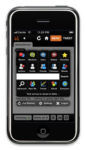
The Hahlo4 menu
Probably one of the most important parts of Hahlo is the menu, without it you can’t get to many of the great features. For Hahlo4 the menu has changed a little from that in the previous version, but I’ve tried to keep the concept behind it the same. I had a great comment from Dan Rubin (thanks Dan) on flickr earlier tonight.
I’m enjoying Hahlo4 so far, *except* for this new menu: partly due to the icons (if they are temporary, that’s understandable, otherwise they seem very out of place style- and color-wise) but also due to how much I liked the display of the nav on Hahlo3. I’d love to see icons from the glyphish.com/ set, for instance…
— Dan Rubin
I started to reply over on flickr but thought I’d move the discussion over here instead. In essence I kind of agree with what Dan’s saying, although I do have my reasons for taking the menu in this particular direction. Lets me say this first though, I really appreciate constructive criticism and suggestions, they get me thinking about things I may not have previously considered.
Why I did what I did
The colours – in Hahlo3 all the icons were blue and orange, I’d grown to dislike them, and with the rest of the interface being refreshed it seemed silly to not update them as well. I did however put some thought into which colours were used for which icons though.
- Red – things you tweeted (Recent, Archive and Sent DMs)
- Blue – friends, followers and tweets and DMs from them
- White – the white silhouette represent you
- Green – everyone, used for mentions, but also on Near Me and Saved
Why did I go for the rainbow instead of keeping it simple and use something like Glyphish as Dan has suggested. The main reason was I wanted people to associate the colours with the functions for quickly finding the icon they are looking for. I felt that it they were all the same colour (and with the number of icons increasing) that the menu would become increasingly confusing to use (the myriad of colours may not have really solved this…)
I’ll admit I’m still not entirely happy with the menu, but it won’t be changing again before this Wednesday’s launch, in particular I don’t like my icons for Trends or Saved Searches. I may revisit these in the next update which will likely also add another row to the menu (for the new retweet api, plus a couple of other new features I’m working on).
Alternatives?
Early on, and I’m talking really early on, like last December when I started working on Hahlo4, I considering a menu very similar to what is now present in the new Facebook iPhone app. Ultimately I didn’t pursue this idea because I liked the hud-style I already had in Hahlo3, but I knew it would still need an update.
I did also consider, simple monochrome icons, I thought (and to a certain extent still do) that they’d fit nicely with the style of the UI but for the reasons mentioned above I didn’t follow that idea very far either. While I do like Glyphish, had I gone down this path I probably still would have made my own (mainly because there aren’t suitable glyphish icons for all the items in my menu).
Future changes/enhancements
I’m open to suggestions, the more the merrier. Once Hahlo4 goes live on Wednesday, and I’ve had a couple of weeks away from working on it, I might start to play around with some ideas in readiness for the previously mentioned update.
Maybe the menu needs less icons, more icons, different icons, different colours, split them over multiple pages (like the Facebook app, iPhone homescreen etc). Leave your feedback, links to examples, whatever, its all helpful.
Wow! That was really bad. Did I really type that? Let’s try again:
It’s fine. Honestly I never really use it. Everything I usually need is right on the home screen. You could probably eliminate half of the buttons for my needs since they duplicate the tabs of the home screen.
It’s fine. Honestly I never really use it. Every I usually need is right on the home screen. You could probably half of the buttons for my needs since the duplicate the tabs of the home screen.